Size and Placement in a Painting
Listen to the video below and/or read as Jackie and Sherrie discuss the important of size and placement in a painting.
Jackie
I wanted to describe more in detail what we mean by size and placement, a term we use often in our library of videos. I believe in almost every video, we describe it and how crucial it is to the success of the painting right from the beginning. Can you shed some light on this?
Sherrie
Sizie and placement has to do with where you place your subject on the canvas.
Often, when people are first starting out, they make the subject grow to fill the entire canvas. It makes sense because your focus is on the subject. So it makes sense that it would tend to grow to fill the space. So sometimes, I think people think about just getting their subject on the canvas. That isn’t the same thing as having beautiful size and placement.
The emptiness or background around the subject is really as important as the subject itself. Ii essence, what happens when you get good size and placement is that first of all, the feeling is that you wouldn’t want to move anything in the painting. Not a quarter of an inch. Everything is exactly where it should be and it feels that way. Often, one way you can tell if size/placement is off, if you hear voices in your head say “gee I wish I had a little room there…or it feels a little crowded there…” Perhaps you will have the same kind of voice guiding you. It is usually when you feel that there isn’t enough space around something.
Size and Placement Painting Examples

If you look at really good paintings, like Rembrandt, Deloscus, Thomas Wilmer doing, he had some very interesting size and placement ideas. All of that is so important because it is tied to your concept in the painting.

For instance, David has an interior studio painting that he did. In fact, that one painting where he has the gypsy portrait on one side. It was a painting that he started as a studio painting and didn’t like the artist that he had put in on the far right, so he left the nude and in the whole space. He had a studio that was 100 feet long and 25 feet wide. It was a gorgeous and huge space. You can see with the nude how much space he has given it around the nude and how important all the space was , the ceiling, and all of that in size with what would have been the artists on the right hand side, which was much larger and closer.
He ended up abandoning that. He had a model coming in and he needed a canvas and he wanted to do it large and she was wearing this kind of gypsy outfit. It was only about 3 hours of work and she just posed once. Then, David had a bad car accident. But you can see the placement of her and also how much space is around her, and how big he decided to make her on that canvas.
All of that had to do with the presence he was trying to create in that particular painting. That painting alone is a good example that shows size and placement. It shows two totally different ideas and how each one of them – the figure – demanded a completely different size.

What’s also interesting, I did one painting at the Metropolitan Museum of Art (MET) from a little sketch. I was going to do it as a large painting and an artist I knew was copying a Rembrandt painting. I used to work at the Met and I knew the Rembrandt room really well. There was a space I really wanted to create in the painting. I thought I could just make the figure a bit bigger. I had it all done, but kept thinking it needed something, so I added a figure on the bench in front. I kept thinking, you know it needs something else, and I put another figure looking at the Rembrandt painting. Just as I was going to put two more figures on the right hand side, a voice in my head said something was wrong. I should have been able to make this work with that one figure.
I wiped the entered painting off and made the main figure smaller. It made all the difference in the world. I didn’t need anything else. It gives you an idea of how important size and placement is. If you get it wrong, it is like creating a black hole and you can’t put enough information in it to fill it. Because it isn’t the right size and placement. Those are good examples of size and placement.
I also remember you Jackie did this amazing demonstration with these pears and I just thought the size and placement was stunning. We will include that as an example too. I just thought it was beautiful.
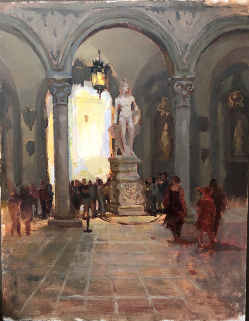
Stacy also recently did this amazing interior where she just nailed the size and placement on this. It gives you such a sense of the grandeur of the room. Really stunning. We will include that as an example as well. It will give you an idea of different settings and different kinds of genres that you are painting how important size and placement is.

Anyway, we could go on and on, but it gives people an idea of how important that initial size and placement is and you may have to wipe it off and try again a few times. That is just part of learning what good size and placement is. If you don’t make mistakes, you are not going to find that sweet spot on the canvas where that object needs to be.
Jackie
I totally agree with you. I always tell students when you are making mistakes, you are actually learning something. Going along smoothly where things work perfectly, there is usually something wrong.
Sherrie
That is some good advice. Talk to you soon. Thanks


Leave a Reply
You must be logged in to post a comment.